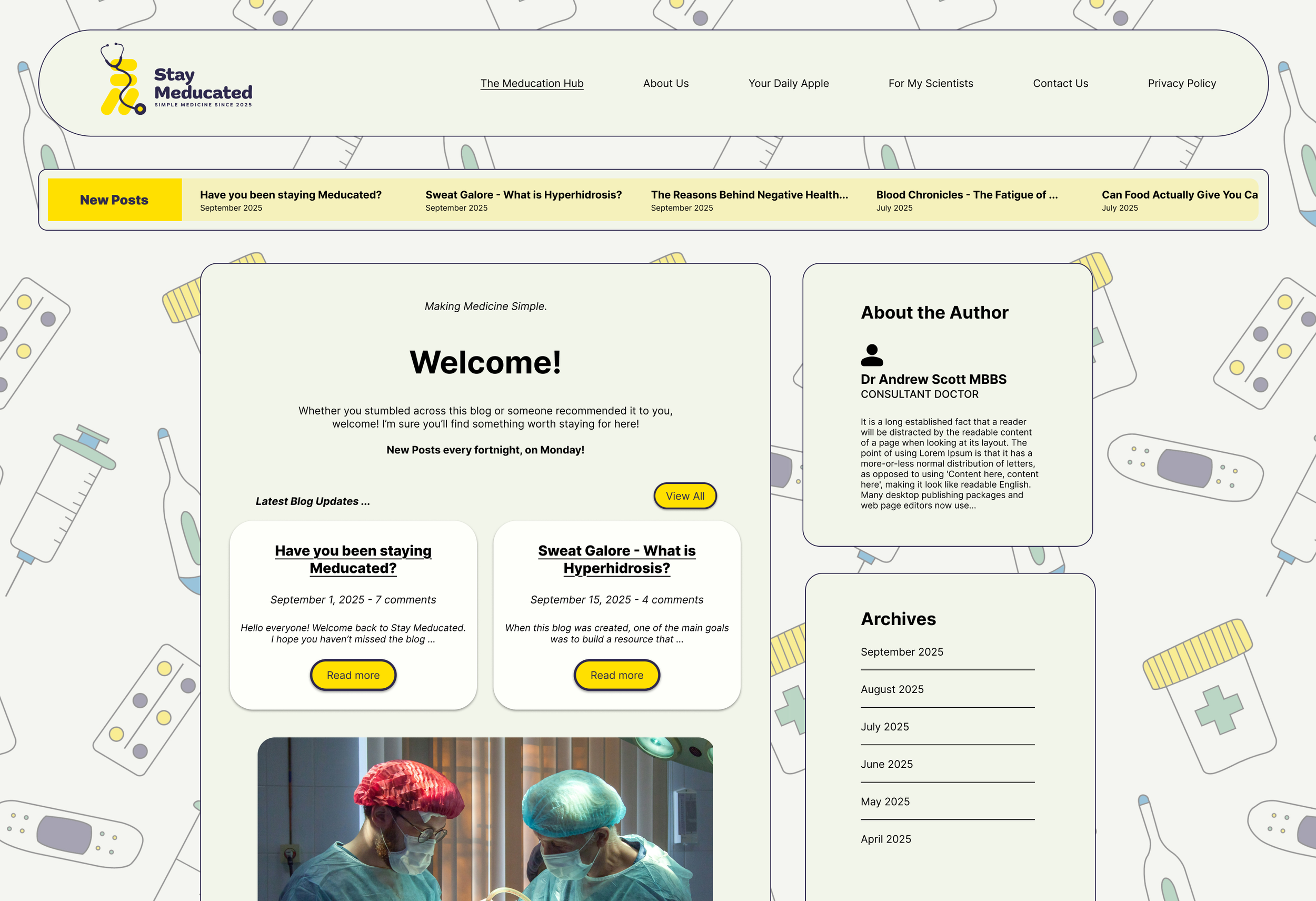
Stay Meducated
Before beginning this branding system, I brainstormed important points to consider for the brand. This revealed lots of important things to consider for the brand when designing the logo and other visual identity parts.
This also revealed key assets for the brand's visual identity, including business cards, social media templates, and transferable assets for the website/blog.
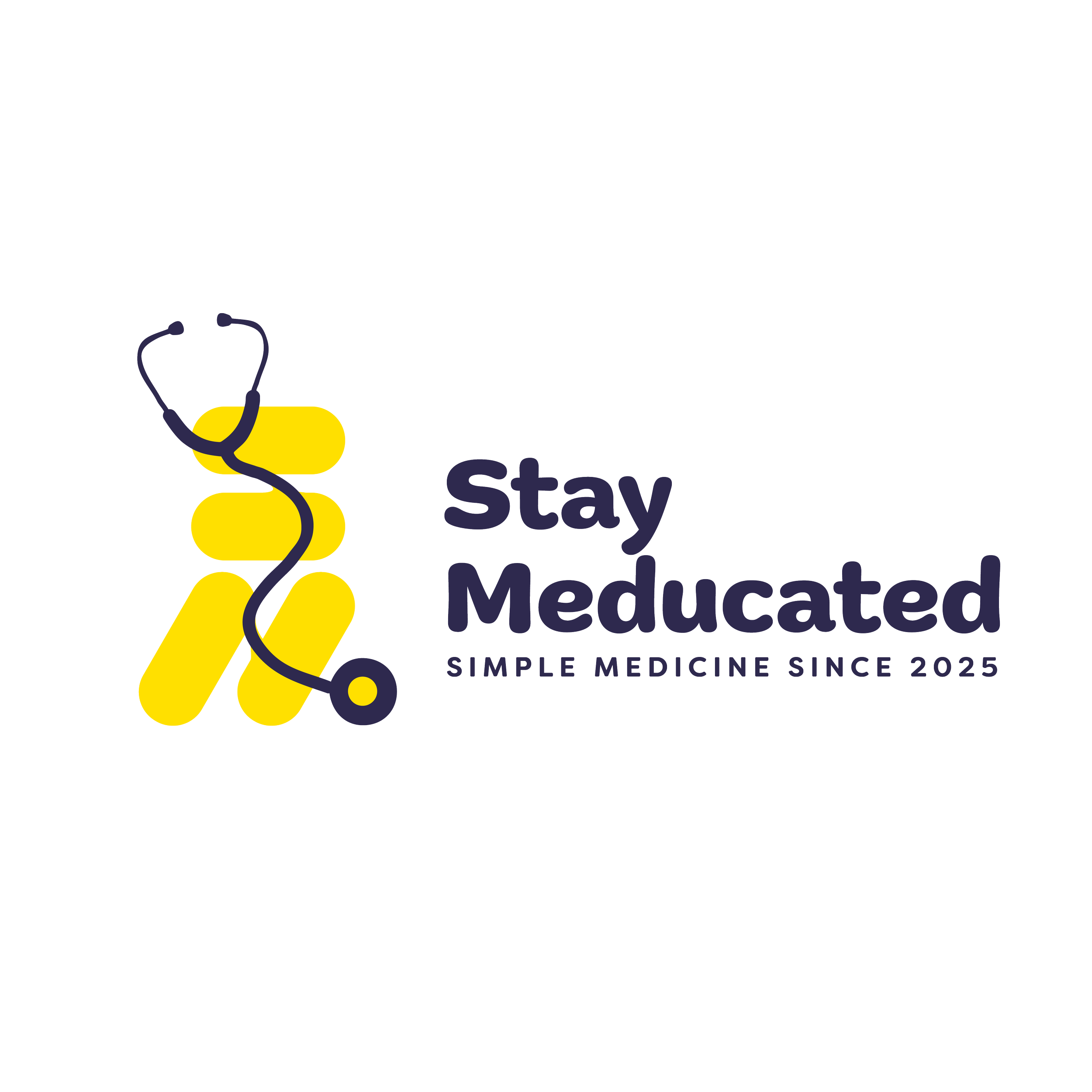
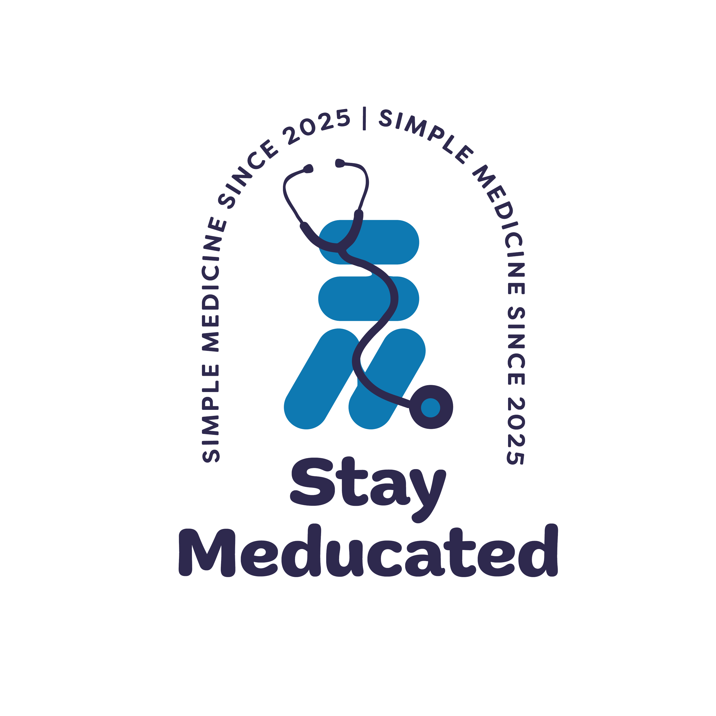
These are the original iterations of the logo in black and white. They capture the friendly vibe that is wanted by the client. The bold font in the logo is also clean and clear.
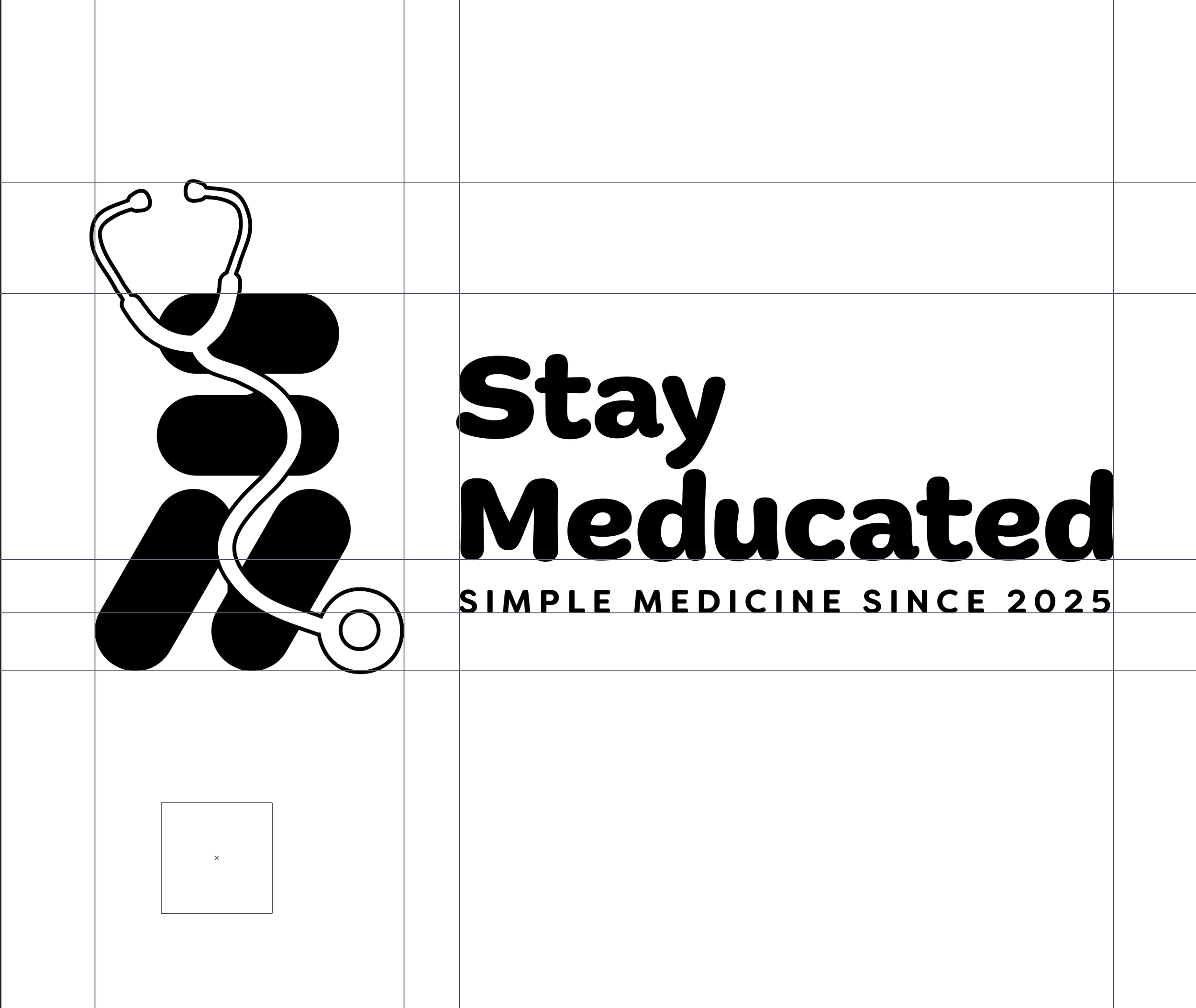
From the minimal, you can also see that the client wanted a combination logo, and the primary logo is exactly that.
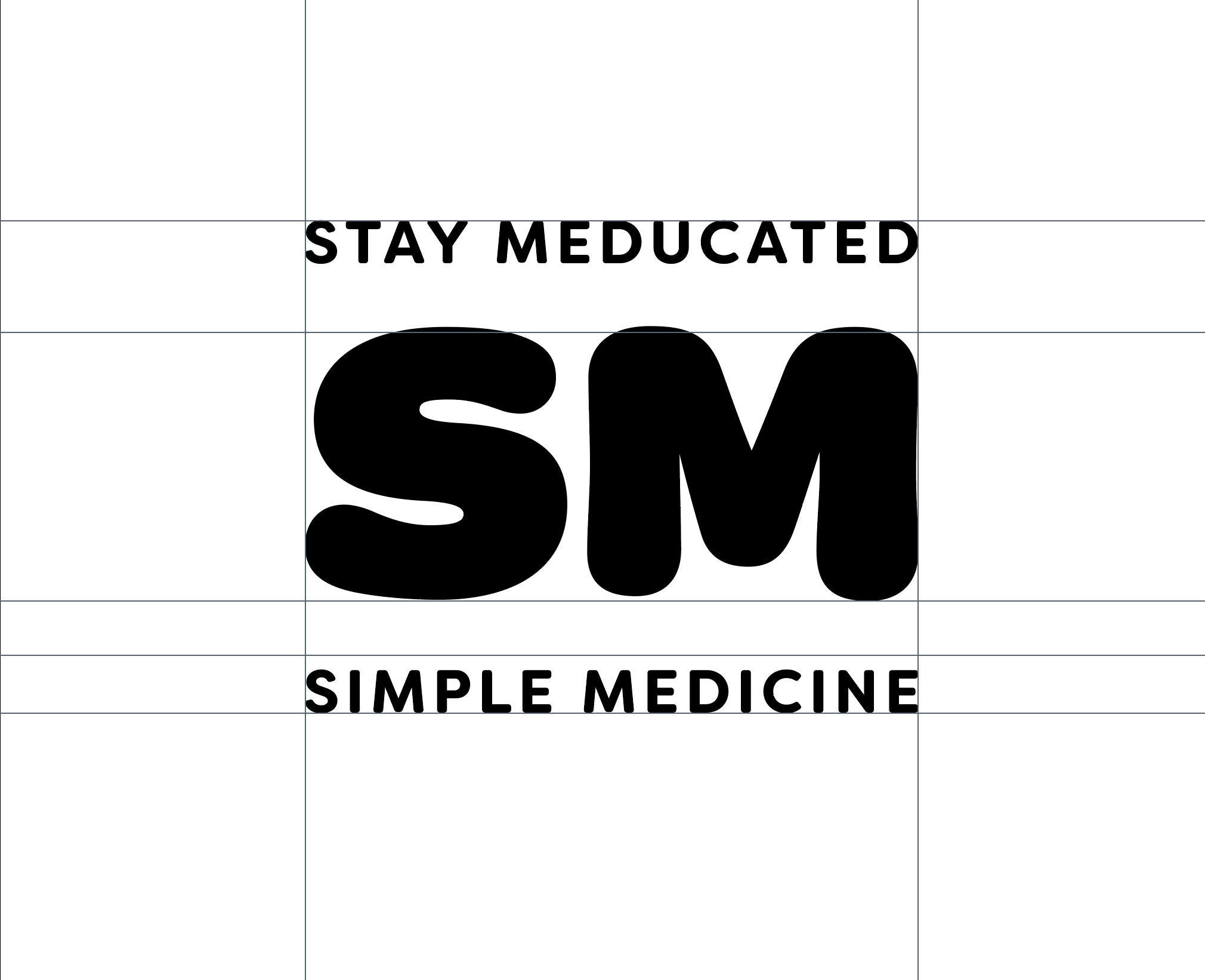
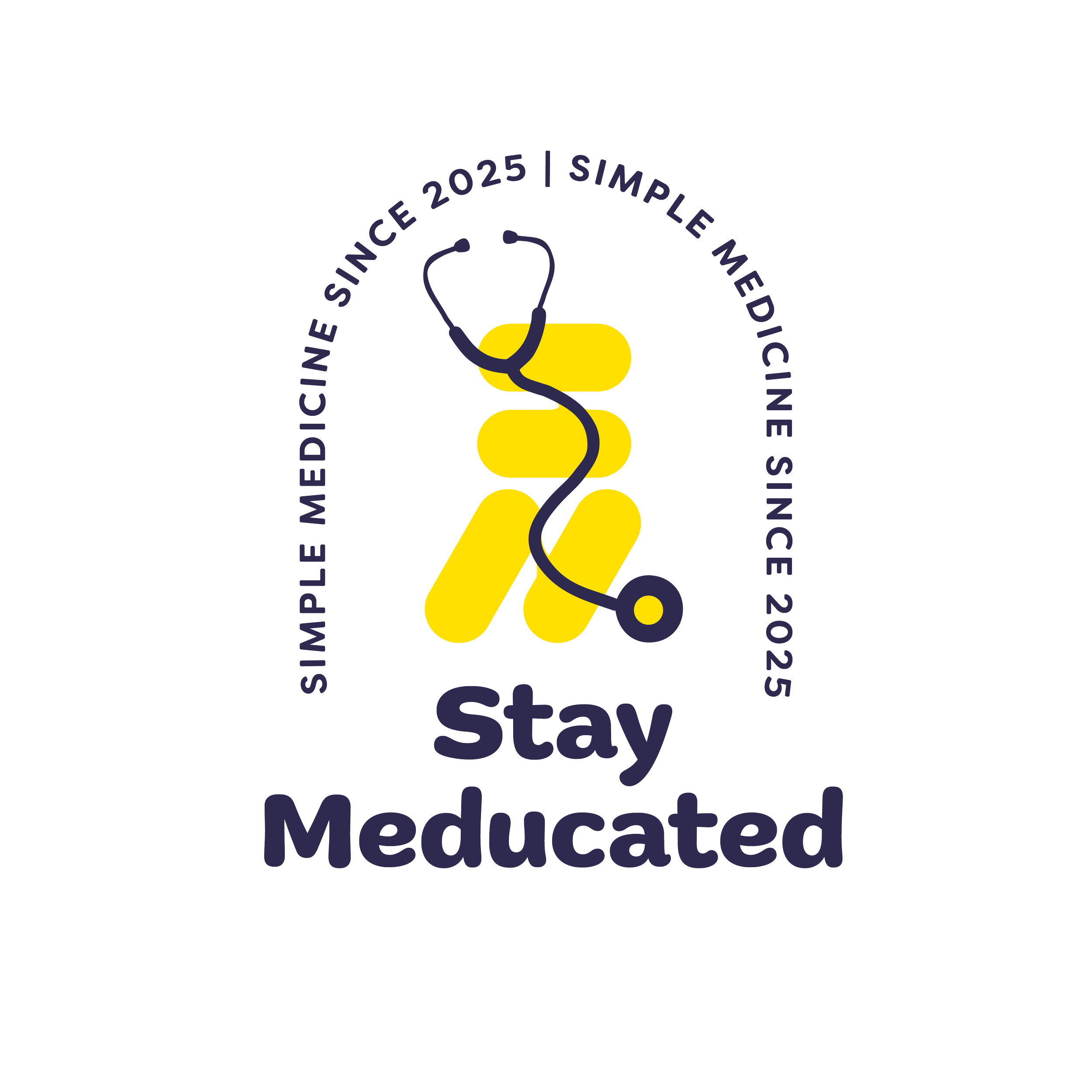
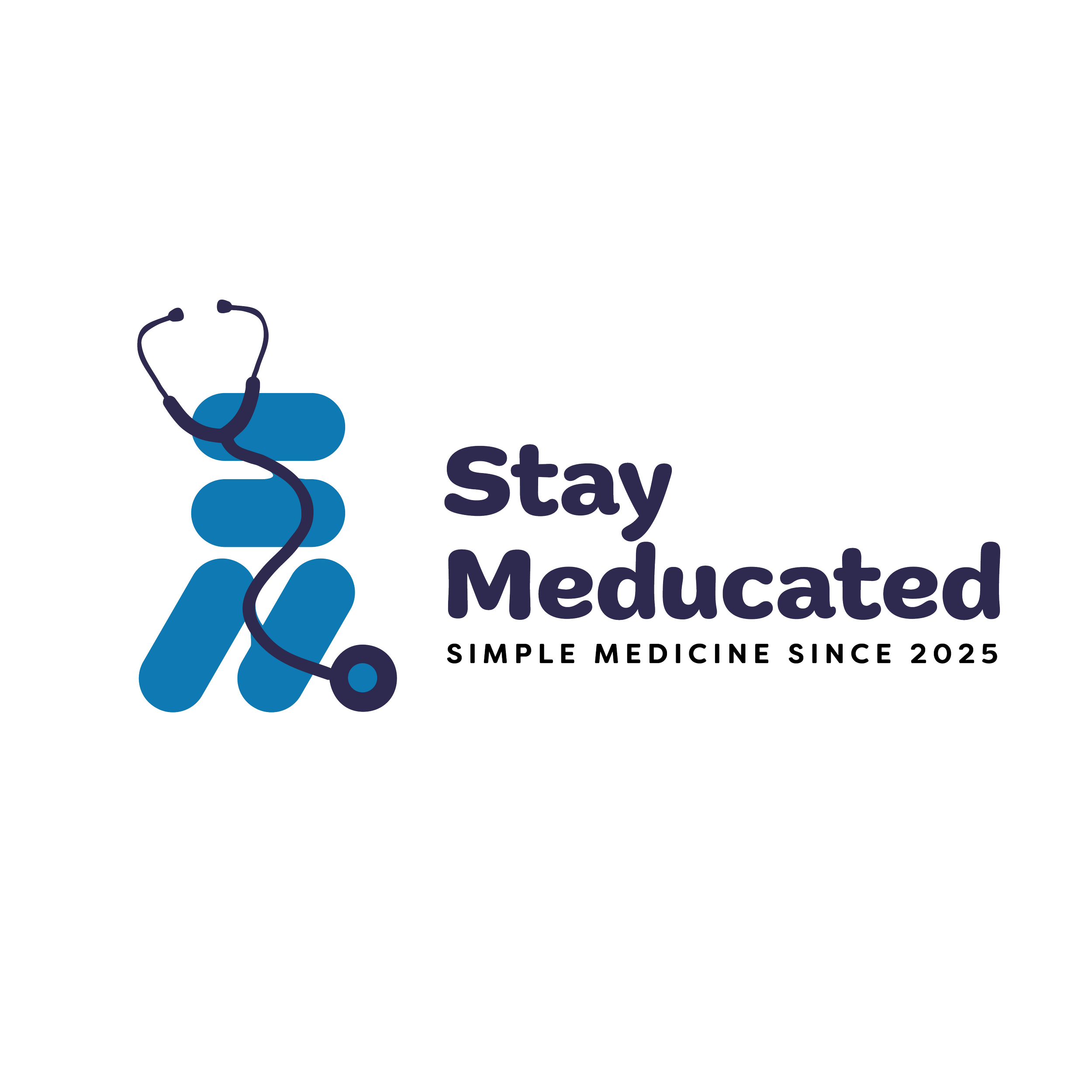
Primary Logo - as mentioned, the primary logo is a combination logo. This logo originated with rounded, elongated rectangle shapes. They represent the shape of many medications, but when arranged in specific ways, can also look like an S or an M. I then connected the shapes using the stethoscope to tie in the medical aspect of the brand in clear imagery. This way, people won't miss the medical aspect of the brand.
The guides were used to help create a good alignment in the combination of the logo.
These are the colours that best fit the brand according to the business and brand purpose. The client, as mentioned above, wanted the brand to be friendly, reliable, bold, and clear.
Yellow - this brings happiness and friendliness to the brand colours, as yellow is usually associated with positivity and friendliness.
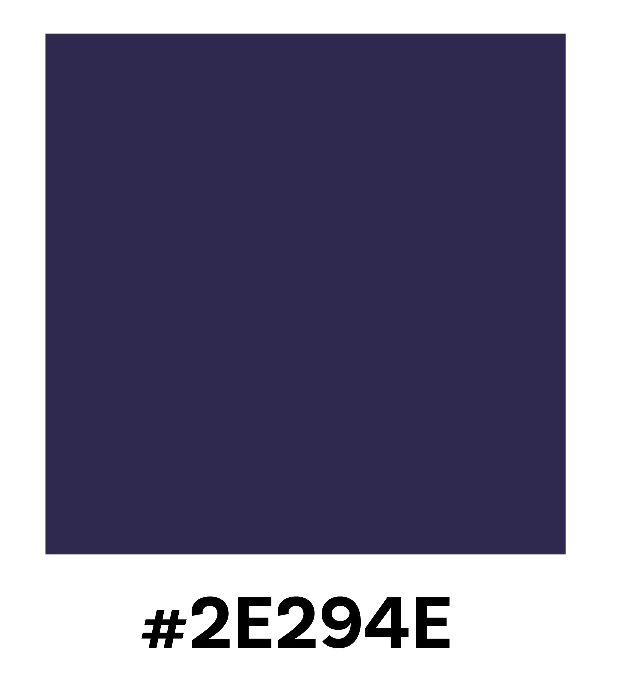
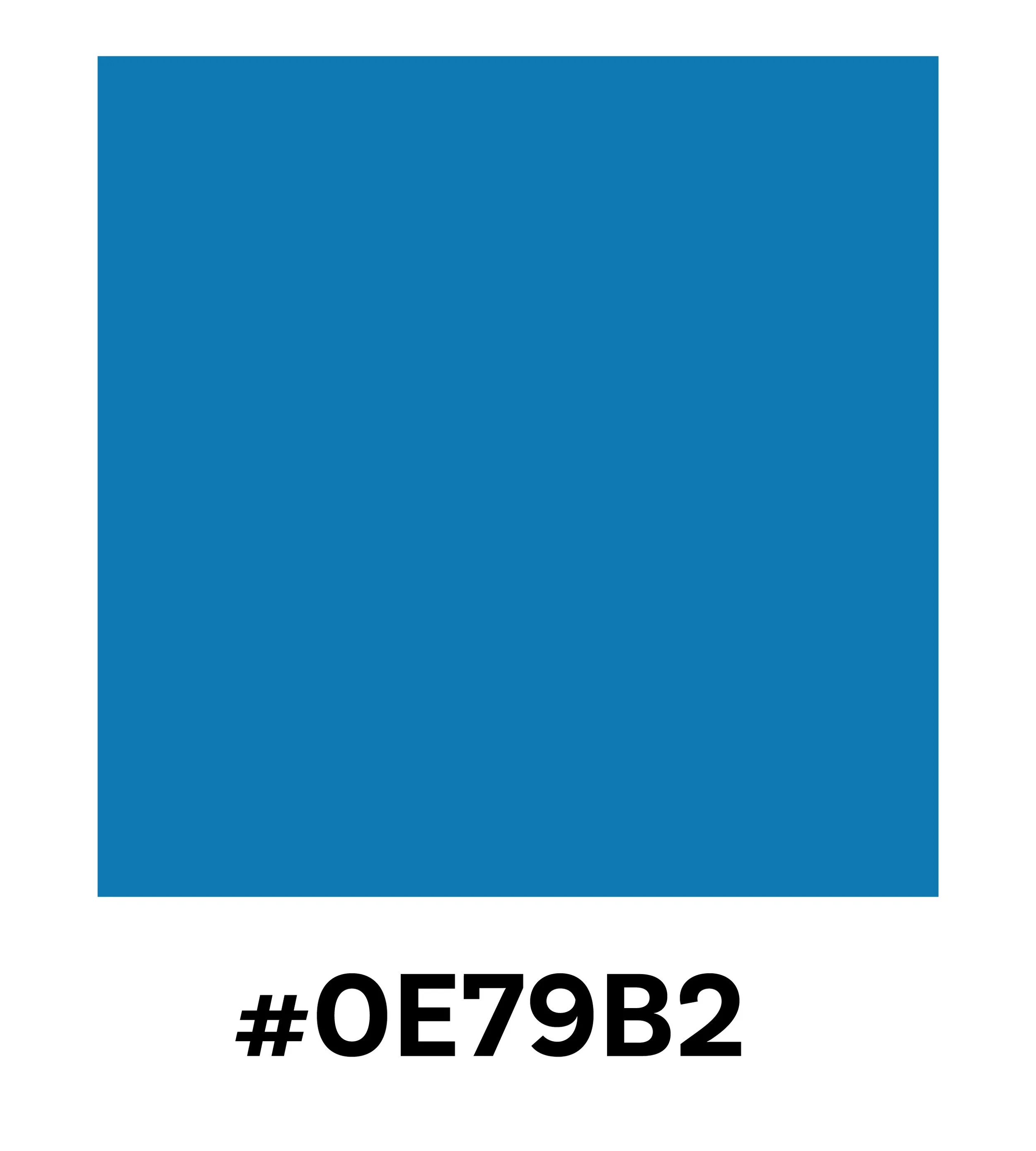
Blue and Navy Blue - both these colours add reliability and professionalism to the brand. The Navy Blue goes further to also add a bold aspect to the brand colours because it is often associated with trustworthiness and wealth.
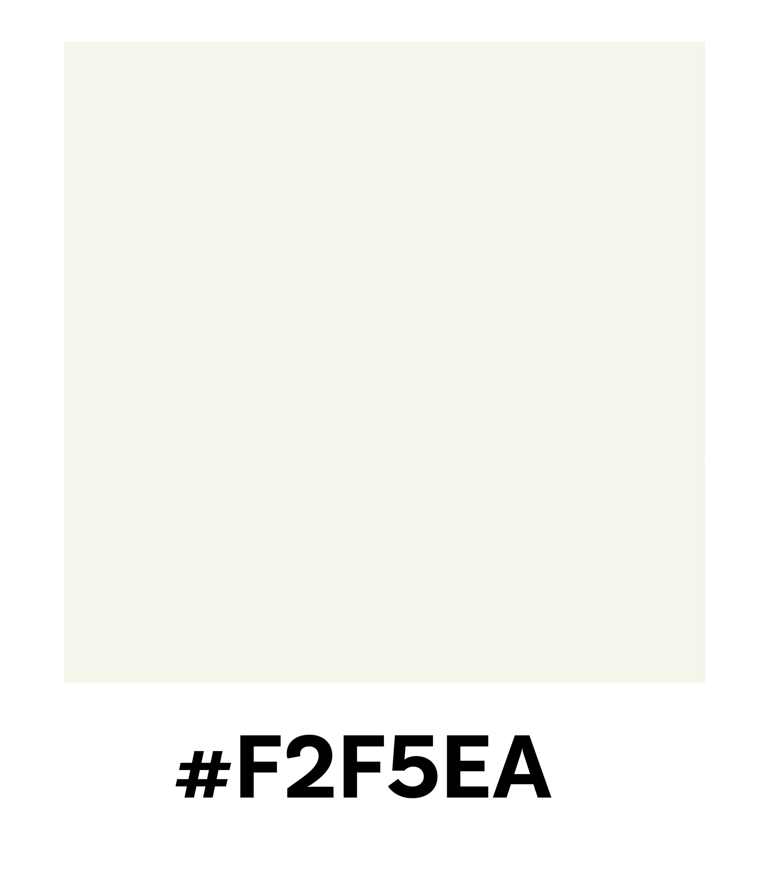
Ivory - this colour was chosen to add balance to the brand colours, to invite contrast into the brand colours.
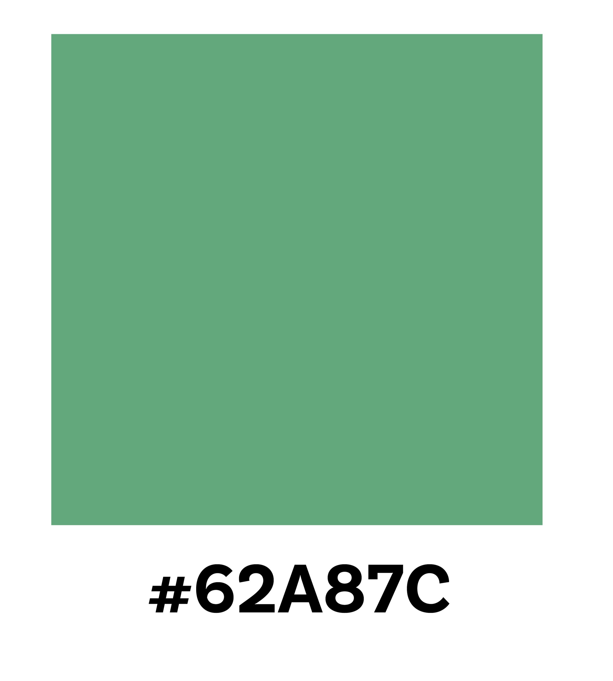
Green - this colour is included in the brand colours because it not only complements the above colours, but it also brings an earthy, natural aspect to the brand, which is beneficial for a brand related to healthcare and natural understanding of the body.
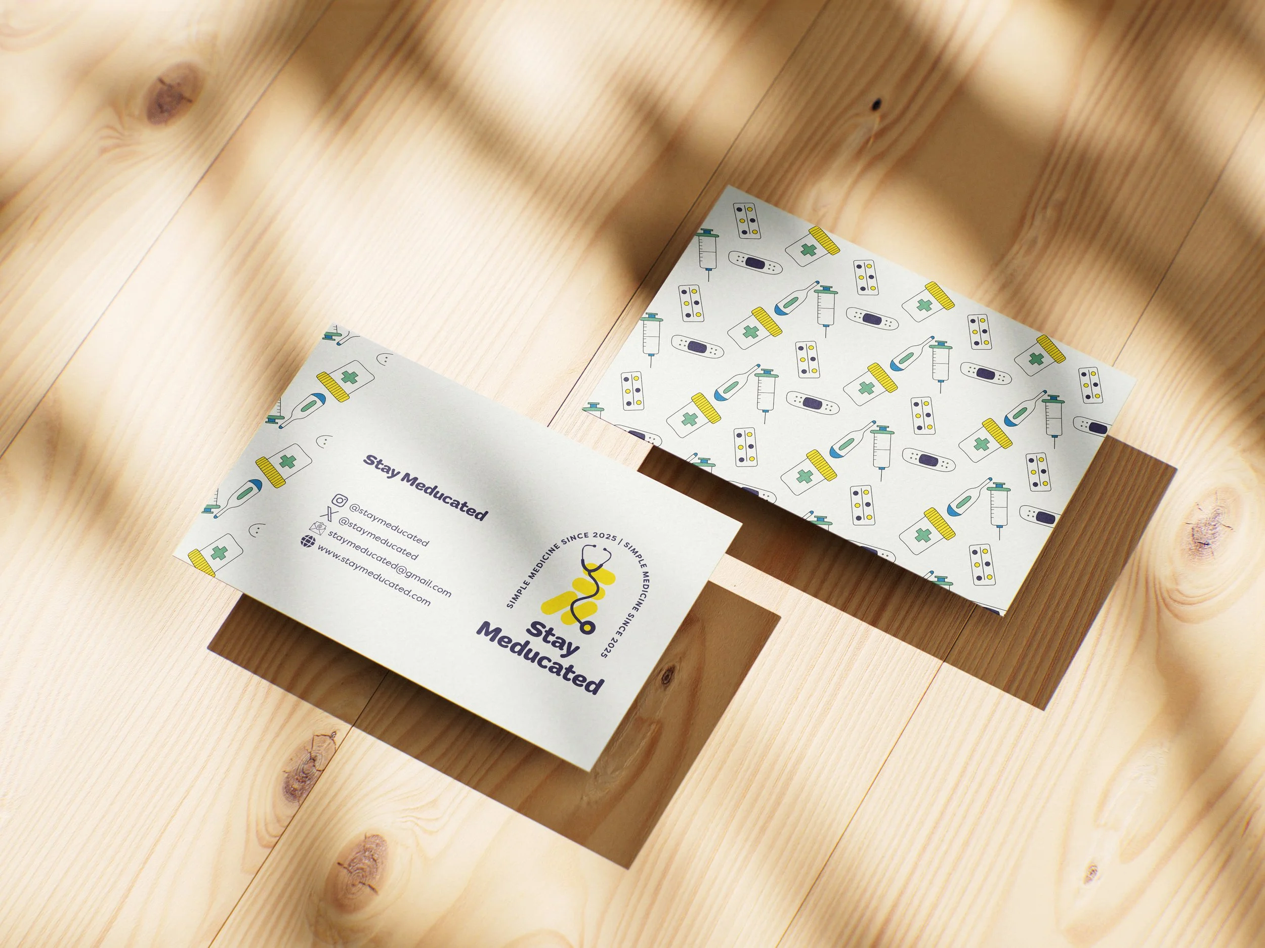
The client opted for a simple brand business card in keeping with the simplicity of the brand. The brand pattern was created using the brand colours and miscellaneous medical equipment to add the medical aspect back into the brand identity.