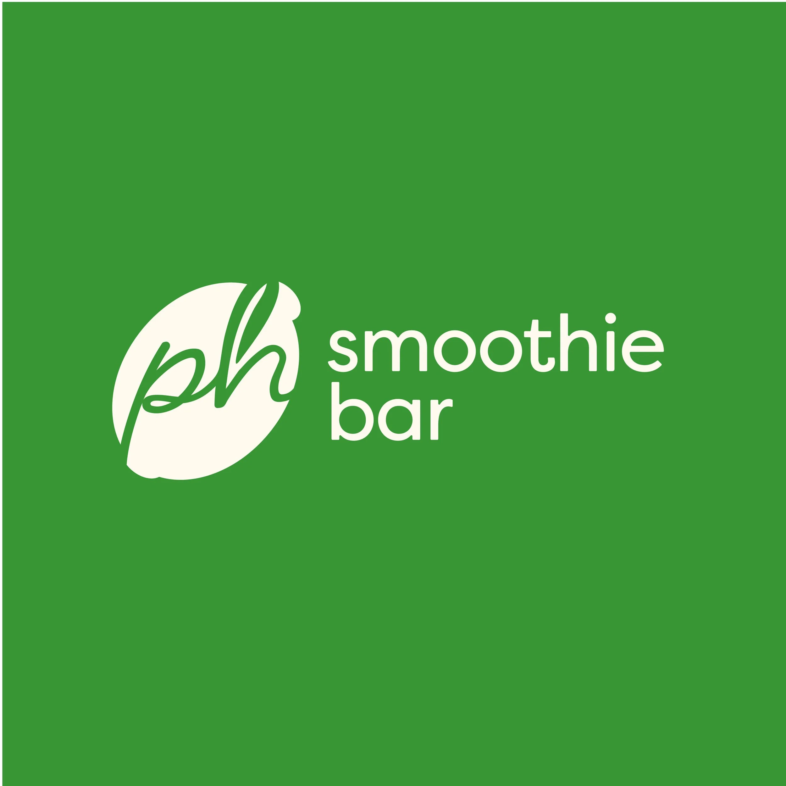
Phresh
Phresh is a modern, health-driven smoothie bar that serves refreshing, nutrient-rich smoothies in a sleek, urban environment. The brand required a strong, distinctive identity that communicates freshness, vitality, and sophistication while appealing to health-conscious professionals, creatives, and lifestyle-driven individuals.
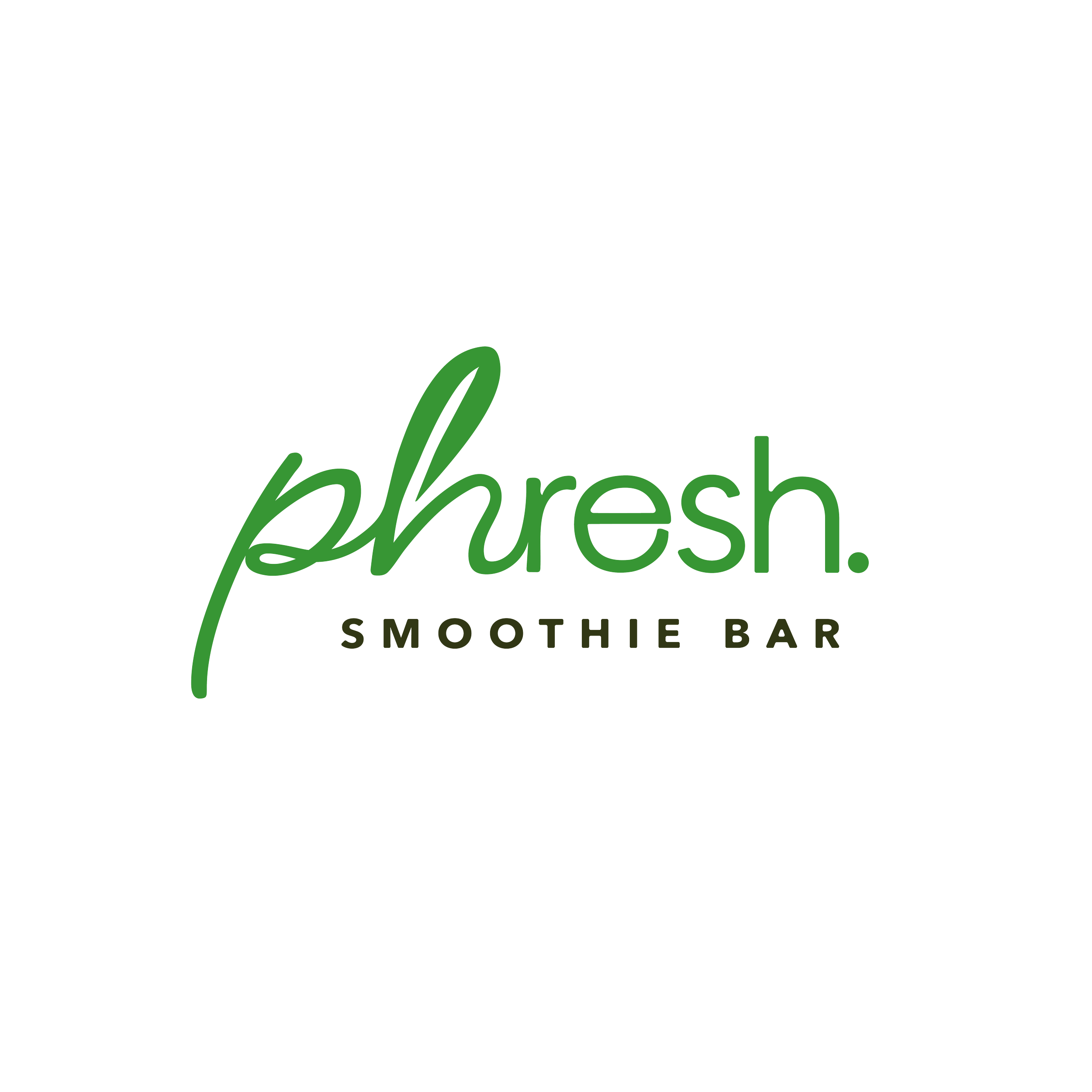
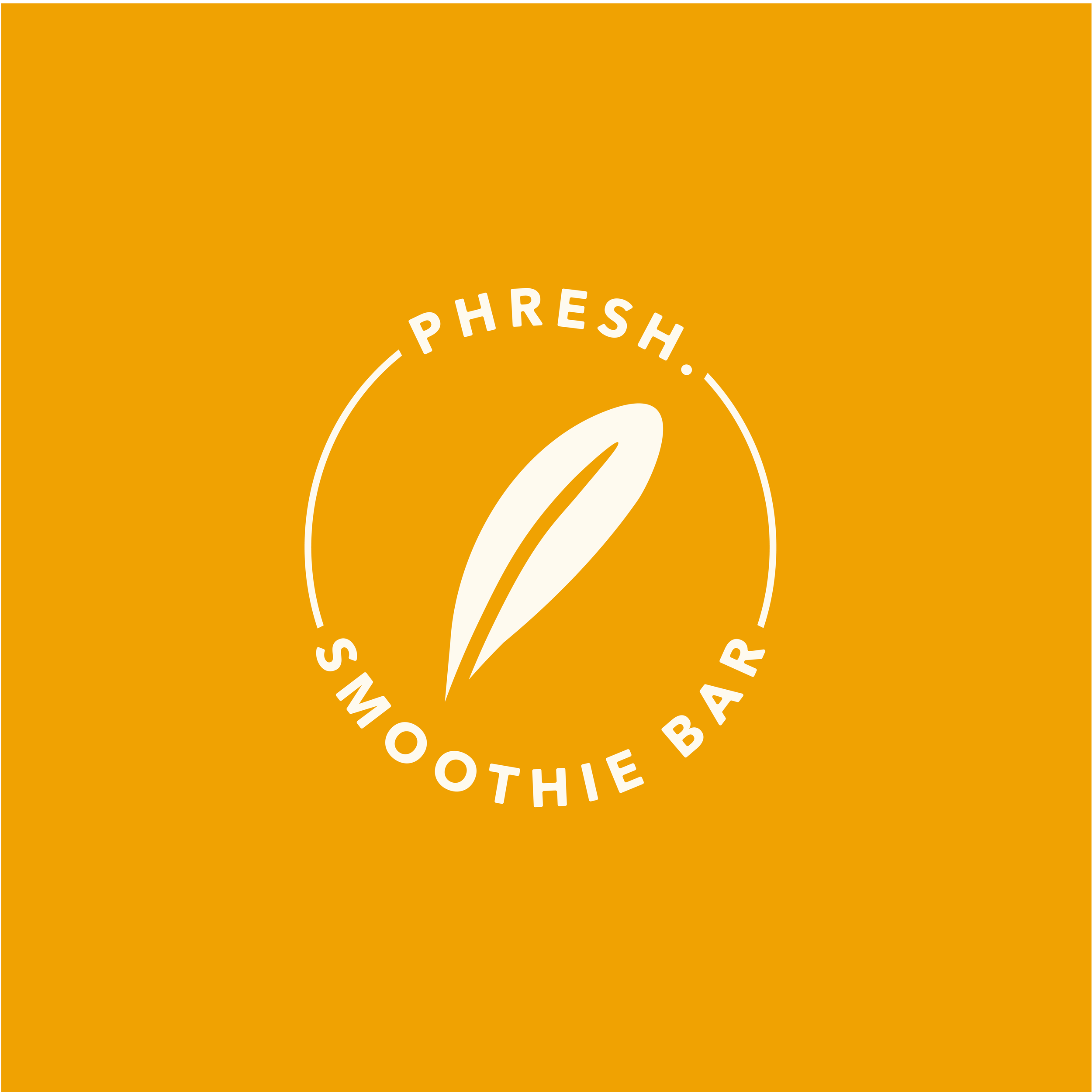
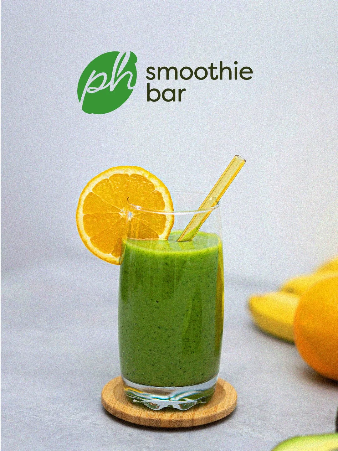
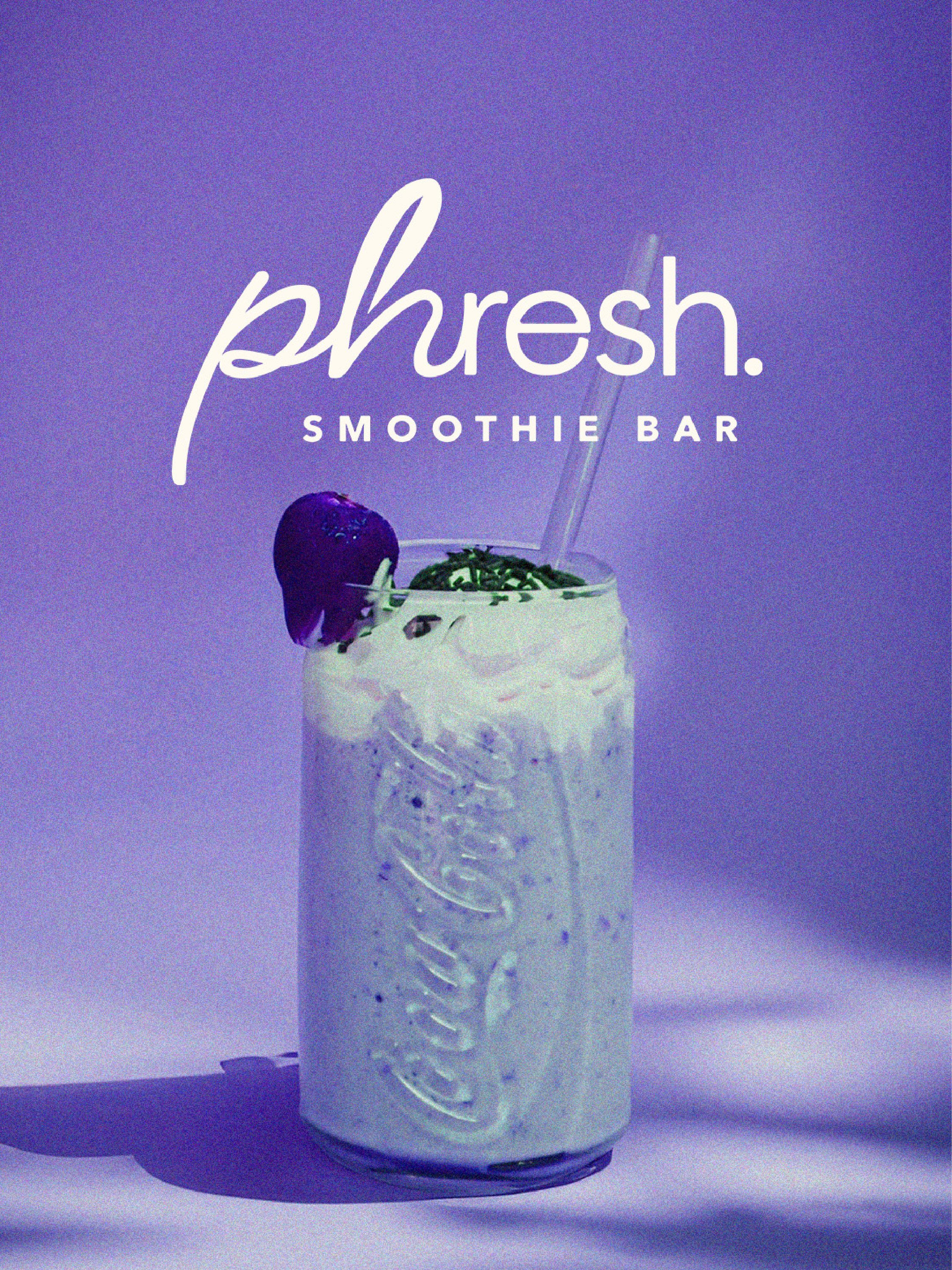
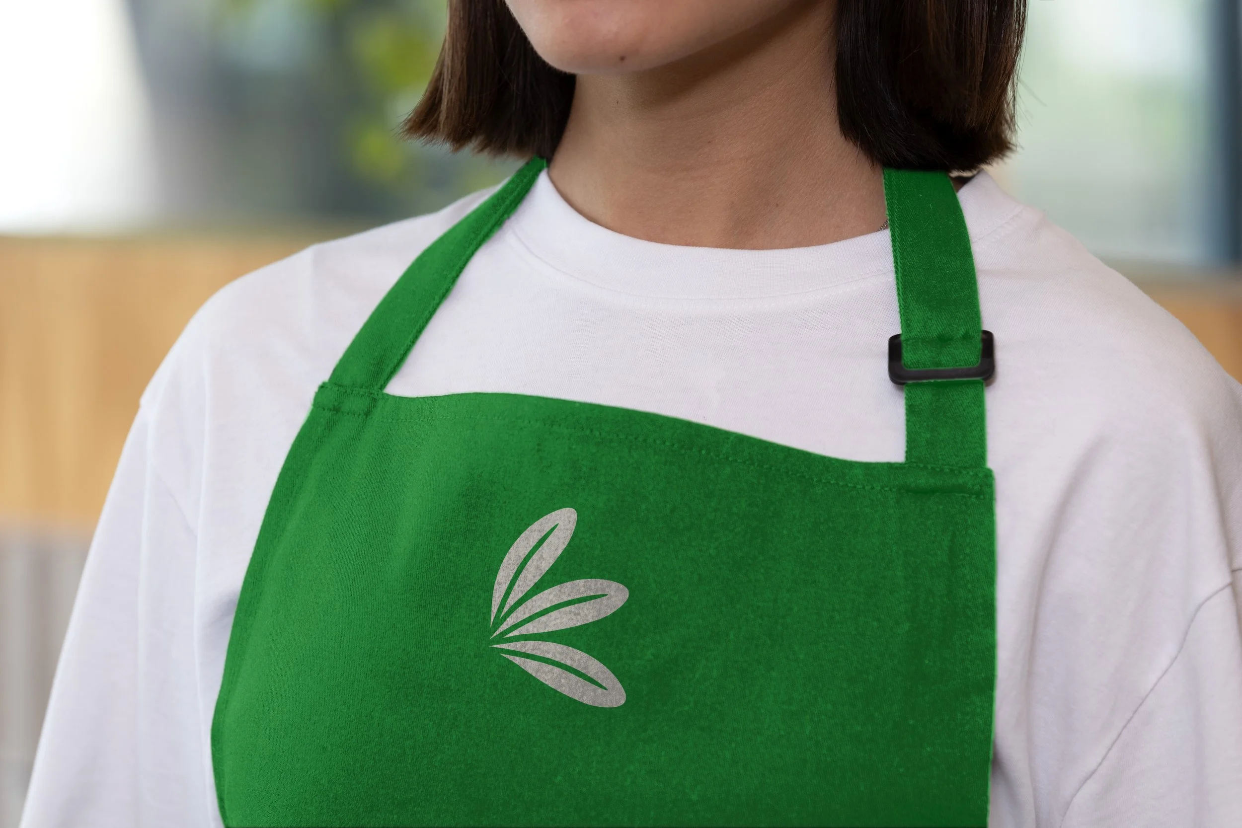
The brand assets were designed specifically to give the atmosphere of freshness, health and fitness.
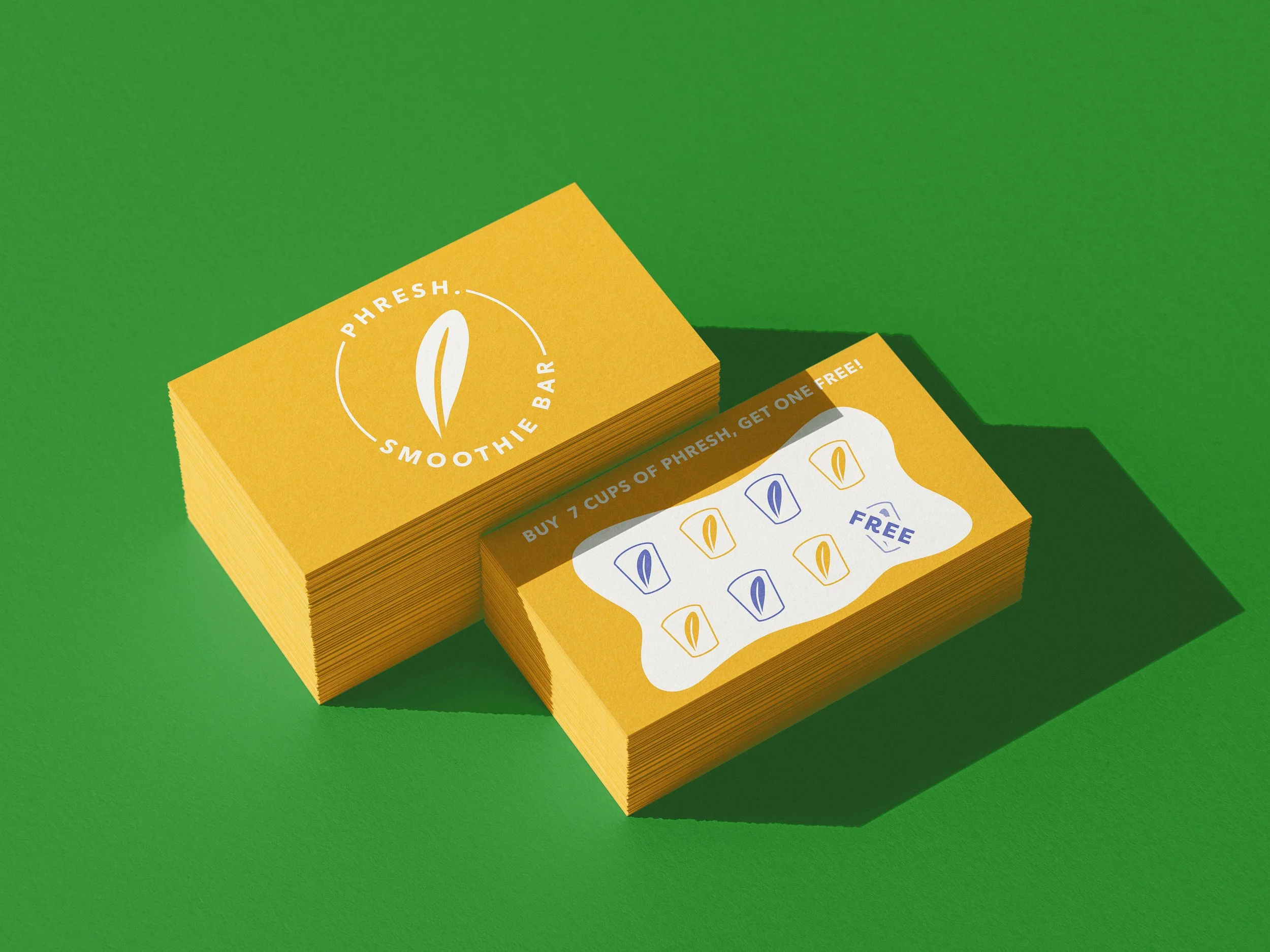
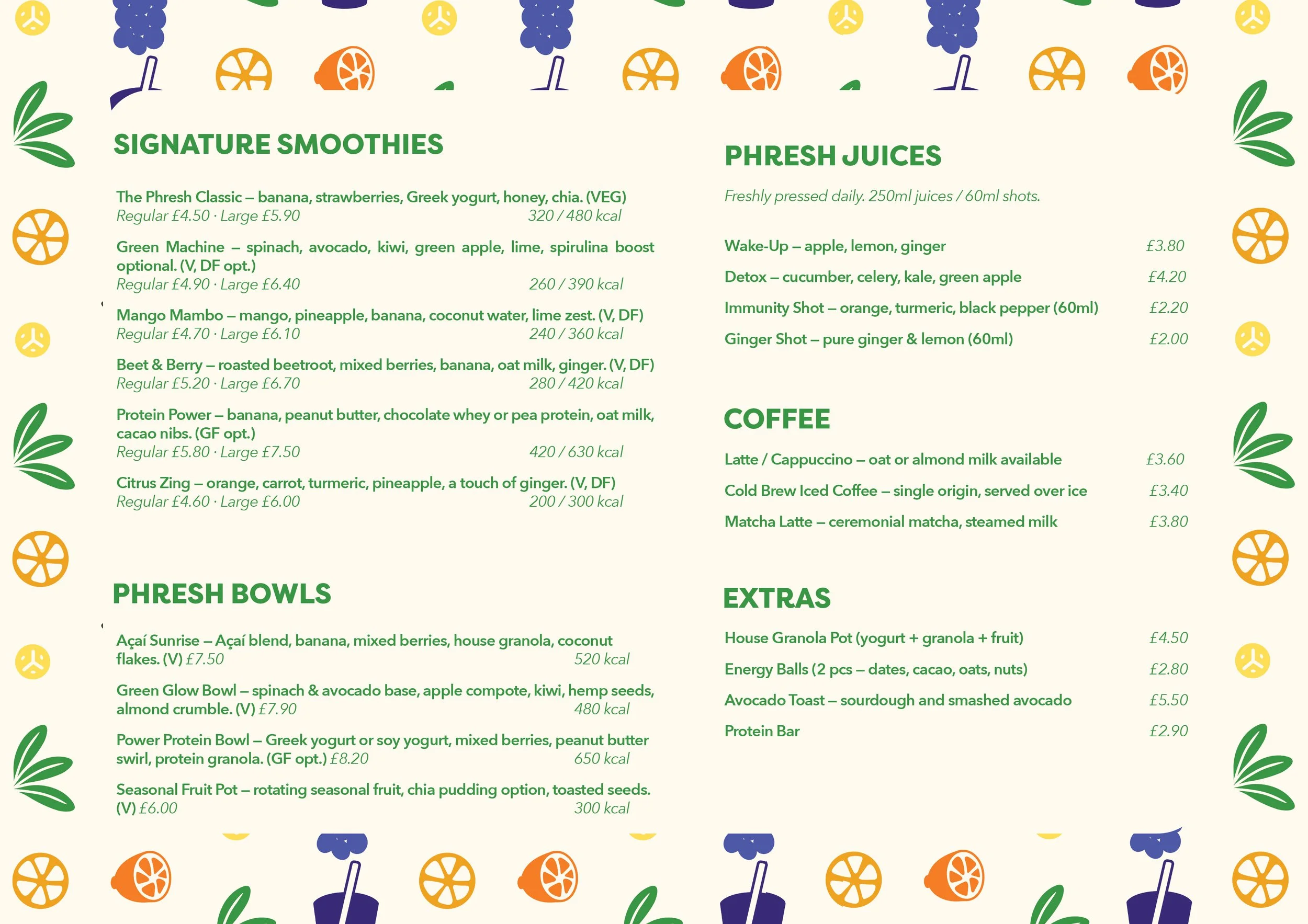
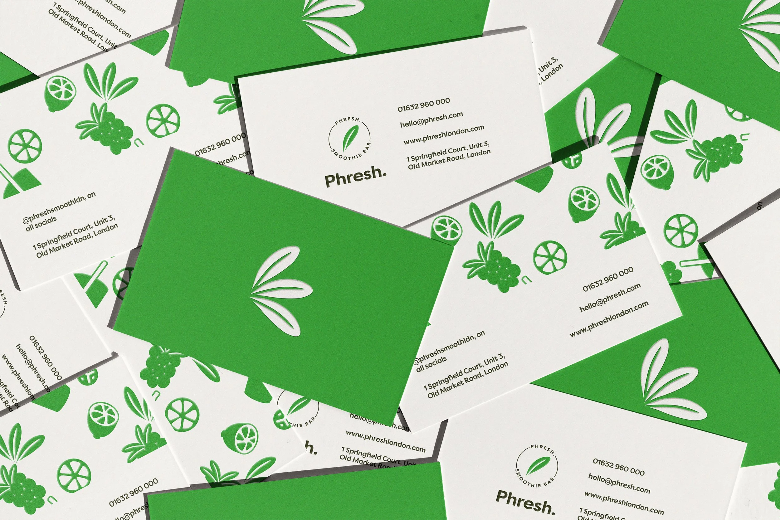
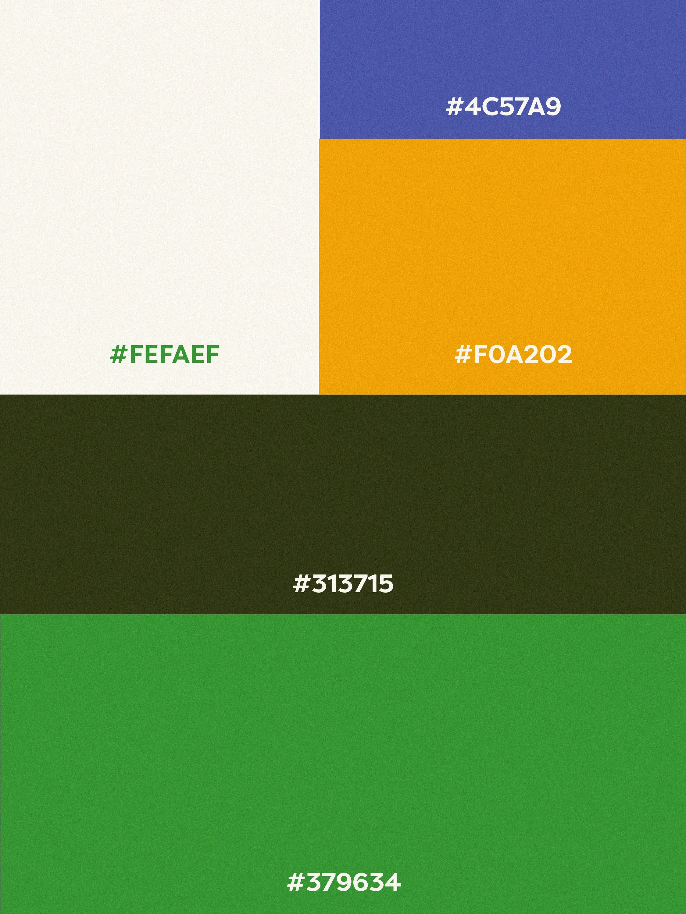
Each colour was chosen to bring both meaning and imagery to the brand. The mix of green, purple and yellow all contribute their own thing to the brand in terms of feeling, but they also represent key ingredients in most smoothies, which are green leafy vegetables, berries, bananas and citrus fruits.
Green - this colour is commonly associated with nature, health and freshness, and therefore works perfectly as the primary colour for the brand.
Purple - this colour represents royalty but also wealth, which is perfect for the brand because it is tailored to those who believe health is wealth and thus value health in that way.
Yellow - this colour was chosen as it is very readily associated with brightness and happiness, and that is the emotion that the brand wants to elicit in its customers. The brand wants its customers to see Phresh as a treat at the end of a workout session. Something they can look forward to.
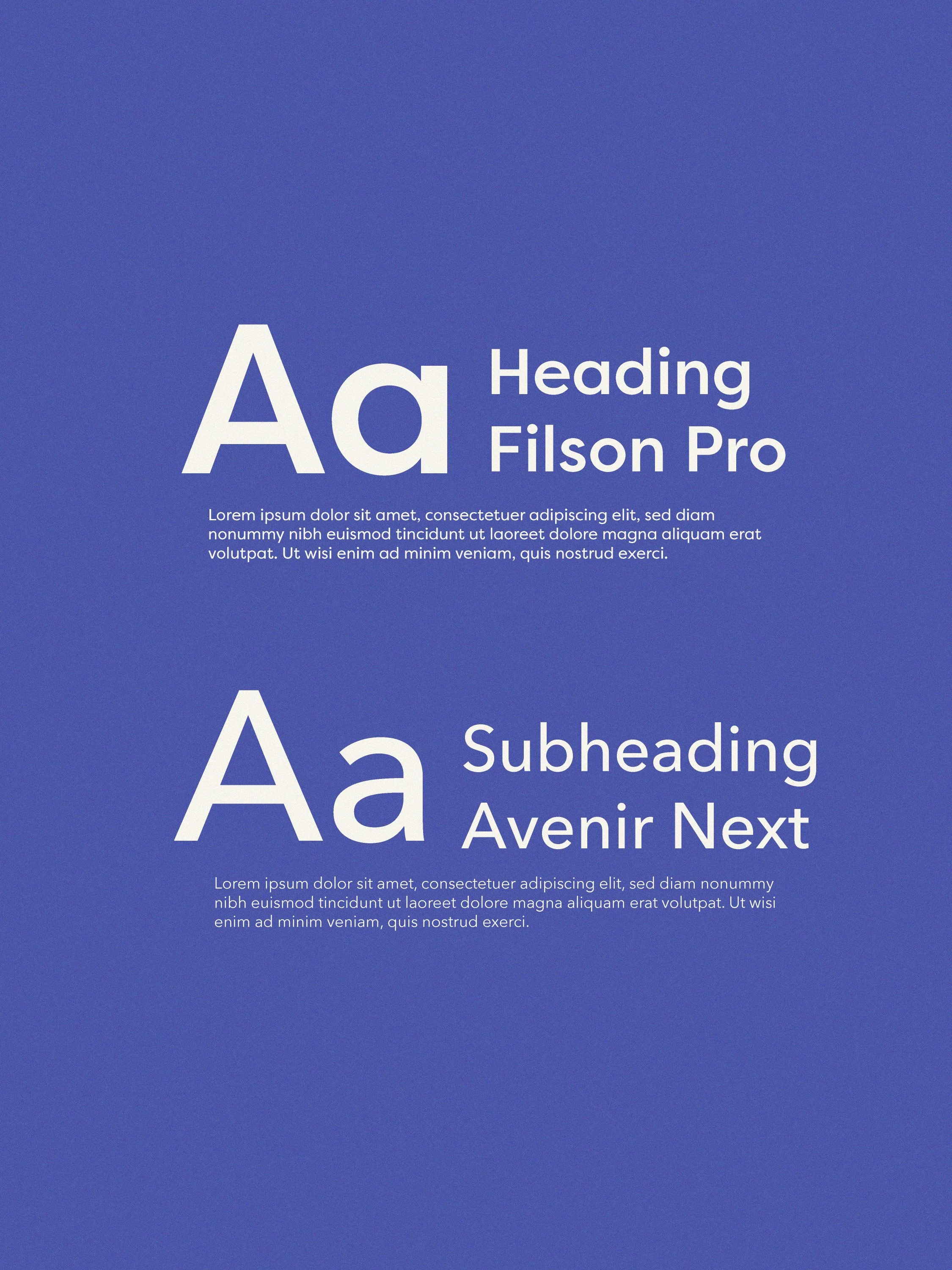
The Typography chosen is clear and easy to read, so customers also know that the brand is simple yet sophisticated.